Chinese short sentence pronunciation lesson by videos
• Lesson two: Order Drinks
• Lesson three: Eating in a restaurant
Final Project
- There are three major topics included learning modules. Chinese learning videos will be uploaded from Youtube website.
Topics to be included in the e-learning course are:
1. Chinese number pronunciation lesson is already on the CI website
(http://www.sfsu.edu/~ci/numbers.html)
- Pronunciation for number 0 to10.
- Pronunciation for number 10 to 99.
- Pronunciation for number 100 to 999
- Pronunciation for number 1000 to 9999
2.Chinese Vocabulary pronunciation lesson by Category
- Eating
- Drinking
- Shopping
3. Chinese short sentence pronunciation lesson by videos
- Lesson one: Greeting
- Lesson two: Order Drinks
- Lesson three: Eating in a restaurant
I finished the frist one and third one, but for uploading the videos, the password of CI to access SFSU server was invalid. I couldn't do any editing on the website. The associated director of CI is trying to get the new password for me.
Hope I can finish it this week.
Final Project Proposal
Final Project Proposal
Web 2.0 Expo
1. ZOHO - www.zoho.com
-Zoho Writer (Online Word Processor): Access, edit and share documents from anywhere
-Zoho Sheet ( Online Spreadsheet Application): Access, edit and share spreadsheets (Import and Export Excel files)
-Zoho Show (Online Presentation Tool): Import and embed presentation in your blog or website. -Zoho Creator (Online Database Application Creator): Intuitive drap-and-drop interface to create customized database applications quickly.
-Zoho Projects (Online Project Management Service): Create tasks, assign owners and speify deadlines, upload files and manage them centrally.
-Zoho Planner (Online Organizer): Add multiple To-do lists with dates. Mark them complete when they get done.
-Other Zoho offerings: CRM, Wiki, Meeting, Notebook, Chat, Mail, Polls, Challenge, Viewer, DB & Reports, Site 24x7
2. Zude – www.zude.com
Feel Free
- Templates: create your own website
- Tag: Everything you add to your zude page is considered an object.
- Drop-Zone Technology: take images from anywhere
- Advanced Properties: Add borders, headers, tooters, shadows and transparency to images, text and other objects.
- File Manager: manage your online content
- Add Pages: build real websites
- Text Boxes: put your text where you want it.
- Rate: Rating can be used to either determine the appropriateness of the content a Zude user posts.
- Widgets: add widgets and gadgets to your zude pages
- Drag-and-Drop Wallpaper: create wallpaper from any image
3. SynthaSite – http://www.synthasite/
A Web 2.0 publishing platform
Anyone can build a website in minutes
Easy to use drag and drop interface
No ads, no banners – It’s your website !
No subscription fee – It’s totally FREE
Compatible with all browsers
4. Profy – http://www.profy.com/
All things blogging
- Blog :Multiple drag-and-drop widgets to configure your blog
- Read Feeds: Have a more productive and satisfying reading experience
- Socialize: Benefit from a platform designed to enrich communication among bloggers and readers.
5. BlueString – http://www.bluestring.com/
- Preserve & Access: Users can manually or automatically add their media files to their BlueString account.
- Create: Users can easily incorporate media from multiple locations into slideshows and creations to capture and share their memories in a richer, more exciting way.
- Share & Collaborate: User can invite friends and family to collaborate on creations by adding their own personal media files to a show.
- Accessories: A tool that automatically copies files added to you’re my Pictures, My Videos, and My Music filders to BlueString.
6. Photobucket – http://www.photobucket.com/
- Easy to sign up a new account
- Upload photos & video: Users can upload from “my computer”, “web URL”, “mobile phone” and “email”.
- Create slideshow: Users can also choose one of styles that they like and create an active slideshow.
- 1 GB free storage
- Integrated image editing: Users can crop, rotate, and flip images.
- Crating a Remix: Remix with Adobe Premiere Express is a new editing tool that will allow you to combine images and video with graphics, captions, borders, transitions, music, and other effects by dragging and dropping content to a timeline.
- Creating a Meez Avatar: create, customize and share 3D avatars in the same manner that you can share your images, videos, and remixes.
- Sharing Content Using “share album” Tab: Sharing an album to Myspace, via Email, Facebook, Freewebs, Friendster, Blogger, Piczo and Tagged.
- Downloading to a Mobile Device
I was thinking to add Flick link as a web 2.0 tool for my 894 project. After I went to Web 2.0 Expo, I would like to use photobucket instead of Flickr. The main reason why I choose it, it’s because photobucket is easier to sign up a new account. I don’t want to provide my personal information for sign a new account for my project because I will link on the website. I also like their another function. It’s better and easier to use than Voicethread. It’s like a online “i-movie” tool.
I received some ideas and learned more useful tools at the conference. I also got free beer, free popcorn, free chips, free cookies and free shopping bags.
Interface Design Critique of WiZiQ website
On Information Design Who are the users?
Teachers and students can use for online learning.
Information chunk: There are three main sections that showing on the front page before sign in. Virtual Classroom Member Search Content Sharing
Although they made a tour for new users, the text button” Take a Tour” is too small to find out.).
Relevance:
Text parts are not heavy on the home pages. Each page is very clear with white and blue colors. Those are very satisfied colors. They use video to demon each section and make clear introduction for users.
Labeling: There are six sections on the top navigation after user sign in. It’s easy to find the schedule with the calendar. Teachers can schedule their lessons (sessions) and also find other sessions from “Public Sessions”. Text with graphic is very easy to find and read. Especially, some main points are labeled
Consistency:
The top navigation is functional for users to use and move easily to each page. All the layouts for each page are white background and using light colors.
Detail:
On “members” section, there too many text links to link. Although there is a search engine for users to find their interested topic and course, it’s hard to read and scroll down the page. It’s better to manage into different fields.
On Interactivity Orientation:
There is a top navigation for users to switch the sections, but there is more details on the bottom. It appears too much for the content information on the page.
Navigation: The top navigation is easy to find and click to switch, but there is no main categories to arrange those “Popular Tags”. The navigation is like a main menu for each element. It’s better to combine the top navigation with the bottom text buttons.
Functionality:
This website is very functional for teachers. Teachers can easily to create their online lessons and share resources with other teachers and students.
Information access:
They provide the search engine for each page. Users can find their interested subjects and topics quickly.
On Screen Design First Impression:
First impression is very clear and simple without heavy text. They use light colors and simple graphic for the layouts.
Resolution:
It’s full screen sizes. Users need to scroll down on the web pages.
Color:
Colors are light colors. The main colors are white, blue and green. Those are nature colors and good for eyes. Text color is dark gray not black. Hyperlink color is blue. It’s very comfortable to look at.
Layout:
Layouts are very simple with white background. The navigation and bottom buttons are always on the same place, therefore users easily to find and change pages. The content information always show on the center of the page.
Readability:
Font and text size are not hard to read. It seems like all the same font for the site. Some important information explain with bigger text size or use bold text or different color to show.
Two well design things

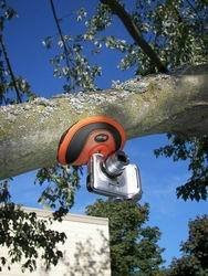
There are two design products that I want to buy. Frist one is the camera stand "Monster Pod". I can use it while I take pictures alone or want to take a picture with my friend, and I don't need to ask a stranger to take a picture for me. I can use it and put with the position that I want. It's really useful for travel too.

Another is the tea spoon. I can put tea leaves in the tea spoon instead of puting the leaves in the cup and drink with the leaves. I like to find new design products and learn new technologies. It's also a way to increase more design ideas.
.png)


